

P.A.W.S. DESIGNS
Logos
REGULAR VARIENT
Style
The client specifically wanted a husky for the logo, and a general rule in modern design is to make designs as simple as possible while still being easily recognizable. So, I decided to create a minimalist style husky logo, featuring limited colors and details.
Color
I chose the colors, dark brown, tan (tan was part of the client’s original color scheme, though in a different shade), and off-white for the logo to subtly reflect the waste themes of the business without being too overt. In addition, using off-white and dark brown creates a more unique look than if it were just black and white, making the brand stand out more.
Text
I chose the typography Nunito for the main text “P.A.W.S.” since its rounded nature represents the fun and light-hearted nature of dogs and fits the fun-loving vibe that the client was aiming for, while also being simple enough to be easily readable. I also chose the “Black” font size to emphasize its importance. I chose Arial for the subtitle text “POOP AND WASTE SERVICES” as it is also simple and therefore easy to read, while contrasting the other text through having sharp edges and being in regular font size. This makes it work better as body paragraph text as well.
Dark Variant
I added an off-white border around the dog to make it stand out on dark backgrounds (specifically dark brown backgrounds).
Light Variant
I added a dark brown border around the dog to make it stand out on light backgrounds (specifically off-white backgrounds). I turned the tan of the subtitle text “POOP AND WASTE SERVICES” into a dark green to make it stand out more on light backgrounds.
Process
I originally drew the design’s outline by hand. Version 1 did not look enough like a husky, like the client wanted, so I redrew it to make it more clearly resemble a husky in version 2. I used version 2 as the basis for the final outlines, though they were edited further.


Version 2


Paws Brand Style Guide
Color
I used green as the background to indicate that it is the primary brand color. I emphasized the importance of headers and subtitles by placing dark green rectangles behind them. I used white for more important text and tan for body paragraph text to create a sense of visual hierarchy.
Text
I used the typography Nunito for the big text, headers, and subtitles, and then Arial for the smaller text, body paragraph, and less important subtitles. They varied in font styles, with Nunito being in Black when large and Extrabold when medium-sized, and Arial being Black for subtitles and regular for body paragraphs.
Contents
To clarify the branding for the client and future designers, I provided the logos, typography, and colors, along with instructions on how to use them and how not to use them, on easily legible pages.

Version 1


A WAY IN THE WILDERNESS LOGO & BRANDING
Idea
The client wanted the logo to appear hopeful, clearly Christian, and have a wilderness theme. As such, I believed including a tree and a cross would be a clear way to show these three factors.
Layout
I placed the cross in front of the tree to mimic its stem. I also had all the elements align super well, such as by making the circle of the sun only slightly wider than the cross and aligning the top of the tree with the top of the sun.
Color
I chose colors that were somewhat dull to avoid the logo looking overly vivid. For example, the original vivid yellow of the sun did not go well with the duller brown and green I had chosen, so I brightened it to make the branding more visually pleasing and consistent. Vividness looks unnatural with the detailed, natural nature of the branding.
Text
For large text, I chose Staatliches, as it is bold and condensed, allowing text to be larger since the letters take up less space. Also, I may have chosen Staatliches since its tall, condensed nature resembled tree stems. I then chose Nunito Sans for the smaller text, as it is my go-to typography. It has a casual, rounded look while looking slightly more fun and less generic than its contemporaries, like Arial.
FAITH RELATED DESIGNS
Friendsgiving Flyer
Layout
Similar to the past few designs, I organized the poster in a way that felt logical in visual hierarchy while also being visually appealing. The most important information, the location/company High Desert Church along with the event title, are at the top for emphasis. A turkey is roughly in the center to make the designs more attention grabbing.
Color
The colors of the designs, mustard yellow, brown, and off white, were inspired by Cracker Barrel, since it is a cozy restaurant that markets itself towards an older demographic and Friendship Class is a church gathering of elderly people. (The client wanted a cracker barrel theming after seeing the turkey picture)
Images
I used an image of a royalty free drawing turkey to represent the Thanksgiving theme of the event. In addition, the image reminded the client and I of Cracker Barrel, which we decided would be the theme. I also created a border for the designs, as requested by the client, to give it to further emphasize the vintage feel and give the project of visual flare
Texture
I gave the designs a subtle paper texturing to further emphasize the vintage and cozy feel.


Fall Potluck Flyer


Layout
I have the text “HIGH DESERT CHURCH” at the top of the flyer to show that they are the overarching “company” (or in this case, Church) associated with the event. I placed the cooking pot in the center of the poster to create a balanced layout that results in some text on top and some on the bottom.
Text
I chose Nunito as the primary typography, as it is easy to read and has rounded edges that add to the cozy vibe of the event. I chose a slightly squished Nunito Sans for the “HIGH DESERT CHURCH” logo text because it is similar to the official logo’s typography.
Color
I chose orange as the primary color, since it is the most common color associated with fall, dark red to act as the darker parts of the design and for its association with fall, and tan as a contrastful background that brings a sense of coziness and authenticity that fall, and potlucks are commonly associated with.
Images
I included edited versions of royalty-free pictures of pumpkins and leaves to further clarify the fall theme.
Texture
A subtle, dark red noise filter affects the entire design, creating a tactile appearance that is fitting for the Potluck’s down-to-earth nature.
Potluck Flyer


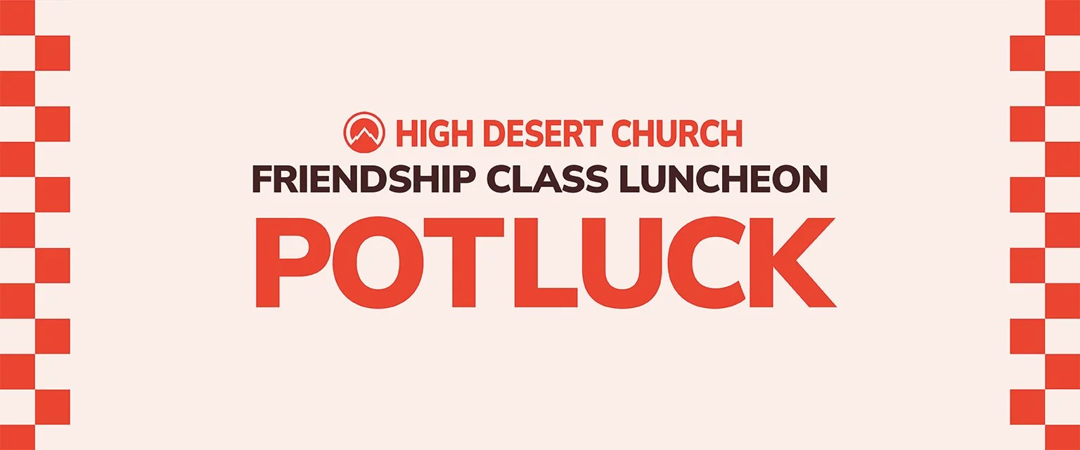
Layout
I have the text “HIGH DESERT CHURCH” at the top of the flyer to show that they are the overarching “company” (or in this case, Church) associated with the event. I placed the cooking pot in the center of the poster to create a balanced layout with some text on top and some on the bottom.
Text
The bigger, bolder, and more colorful a text is, the higher in the visual hierarchy, and the more important it is. “POTLUCK” and “5” are the highest in visual hierarchy at a size of 101 points because they communicate some of the most important information about the event: what the event is and how much it costs to attend. “14545 Hook Blvd, Victorville | Located in the Gym” is the lowest in visual hierarchy at a size of 17 points because the audience already knows and regularly attends the event’s location.
Color
The event’s decorations will have a color palette of cream, black, red, and white, so I made the flyer’s colors similar. The reason I made the red a bit orangish and the “black” a dark brown was to give the advertisement a less harsh and more harmonious look. Bright red and pitch black appear unwelcoming, which would strongly go against the fun, almost cozy mood of the event.
Shape
I made the poster more visually appealing by using various shapes. I created a cooking pot icon to give a visual indicator that the flyer is advertising a potluck while maintaining simplicity. I included a rounded rectangle behind the cooking pot to emphasize it and make the flyer more colorful. I have checkerboard patterns on the sides of the flyer to continue the previous Friendship Class Luncheon Potluck flyers’ trend of having a picnic blanket pattern.
Serenity Prayer Poster


Layout
I put the title “SERENITY PRAYER” at the top to indicate that this is the title of this famous prayer. I split the prayer into two separate paragraphs to reflect the original format of the prayer.
Text
The bigger, bolder, and more colorful a text is, the higher in the visual hierarchy, and the more important it is. “SERENITY PRAYER” is, therefore, the most important text because it indicates to the audience the name of the prayer and its subject matter. I had the first word(s) of most phrases be higher in visual hierarchy because they are usually the most important or practical parts of the prayer. For example: “Serenity”, “COURAGE”, and “WISDOM” are big because they reflect what the prayer is asking for in its simplest form. I chose Lucida Calligraphy Italic because it is both an easily legible font and has a “cozy” handwritten look that appeals to the target audience of Christian women, who tend to enjoy handwritten typography, as it represents the authenticity and down-to-earth nature of their faith.
Color
For the first variant of the poster, I chose blue since it is commonly associated with peace and made it somewhat dull to reflect the serious nature of the prayer. For the second variant, the client wanted the color to match a “Traditional Medicinal: Rosy Mood Tea” bag/box, so I used the eye-dropper tool on a picture of it and applied the maroon-ish color to the design.
Icons
I chose a dove holding a branch in its mouth, as it is a common Christian symbol for peace, and, therefore, acts as a visual representation of the prayer. In the second variation, I added a rose to the branch to reflect the “Rosy Mood Tea” theme.
Philippians 3:13b-14


Layout
The verse is centered on the paper to give a balanced appearance to the design. The Trophy is located roughly below the word “PRIZE” to give more emphasis to the connection between the verse and image.
Text
The words that discuss action, God, and the main theme of a heavenly prize, are emphasized by being bigger, bolder and more blue than the rest of the verse.
Color
I chose yellow for the trophy color as it is a common color for trophies and is associated with holiness, reflecting its Christian theme. Some of the letters are blue because it goes well with the white background and complements the yellow of the trophy.
Icon
I created a trophy icon with a cross on it to thematically represent the prize given by God to believers (Heaven) as discussed in the verse.
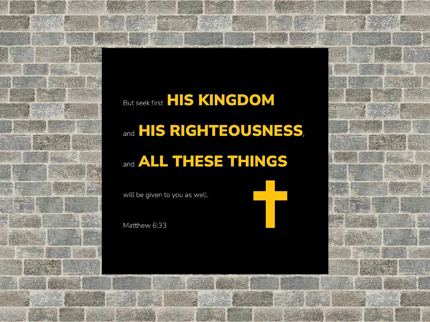
Matthew 6:33 Design

Layout
I aligned the cross with the right side of “ALL THESE THINGS” and the bottom of “Matthew 6:33” to create an organized and therefore appealing look to the design.
Text
The text is spread out (the leading is high) so that it covers a significant portion of the square aspect ratio. I make the major subject words of the verse big, bold, and yellow to emphasize their importance.
Color
I chose yellow for the important text and cross because it is associated with holiness and therefore fitting for the Godly themes. The brightness of the yellow contrasted on the black background thematically portrays the idea that God is the light in this dark world.
Icon
I created a cross icon as a simple visual representation of the Christian themes of the verse.
Armor of God


Layout
I gave the design 1-inch margins on all sides to give it a spacious feel. I also have all the icons at an equal distance from each other, and the text aligned with the icons to create a consistent and organized look.
Text
I use three sizes for the text, with bigger and bolder text being more important. The title is the largest text at 57 pt and has black boldness, the armor part names are 22 pt and have black boldness, and the body copy text is 11 pt and has regular boldness.
Color
I chose a gold color for the important text and icons because it is associated with holiness and, therefore, fitting for the Godly themes of the design.
Icons
I found royalty-free pictures of all of the parts of the Armor of God to give visual emphasis to the themes of the passage, creating a more visually appealing design.
ALL PAWS SHELTER
Logo
Text
Since rounded typography is associated with femininity, I used it to make the logo appear welcoming. I use sans serif typography for all the text to create a clean, modern look.
Color
Since pink is associated with femininity, it conveys a sense of care in the logo. I also made the light version have a black outline to make it stand out better.
Shape
I made the palm of the paw print a heart to convey the caring theme.
Flyer


Layout
I have spaced all the bodies of text equally to create a consistent and visually appealing look.
Color
Since pink is associated with femininity, I use it to convey a sense of care in the poster. I made the background dark blue to reflect the hurricane theme. This color combination sends the visual message that All Paws Shelter will be a help during the troubling times caused by the hurricane.
Text
I use bold typography and all caps to emphasize the call to action text, “DONATE TO SUPPORT ANIMAL SHELTERS,” over all the other text. The boldness and size of the texts roughly correlate to their importance. I use sans serif typography for all the text to create a clean, modern look.
Pictures
I used a picture of a sad dog to give the audience empathy for the animals affected by the hurricane, making them more likely to donate.
Postcard


Layout
I have spaced all the bodies of text equally to create a consistent and visually appealing look.
Text
I use bold typography and all caps to emphasize the call-to-action text, “DONATE TO SUPPORT ANIMAL SHELTERS,” over all the other text. The boldness and size of the texts roughly correlate to their importance. I use sans serif typography for all the text to create a clean, modern look.
Color
Since pink is associated with femininity, I use it to convey a sense of care in the poster. I made the background dark blue to reflect the hurricane theme. This color combination sends the visual message that All Paws Shelter will be a help during the troubling times caused by the hurricane.
Pictures
I used a picture of sad dogs to give the audience empathy for the animals affected by the hurricane, making them more likely to donate.
FRESH FARE FARMS
Poster

Layout
I have one half of the poster contain only text and the other half contain only images to create an organized and easy-to-read layout.
Text
I made the brand slogan, “Local. Sustainable. FRESH." big and bold to emphasize it over all the other text. This also heightens the sense of brand identity in the poster. The boldness and size of the texts across the whole poster roughly correlate to their importance. I use sans serif typography for all the text to create a clean, modern look.
Color
The project made us choose 6 out of 8 different colors. I used these colors in strategic ways. For example, I made the more important words dark purple to emphasize them over the lighter body paragraph text. I also emphasized the word “FRESH” by making it the only word that is orange. This heightens the sense of brand identity in the poster since the company is named Fresh Fare Farms.
Pictures
I used pictures of healthy food to portray the kind of service that Fresh Fare Farms provides. I also included a happy family picture to relate to the target audience of families.
Three-Panel Advertisement

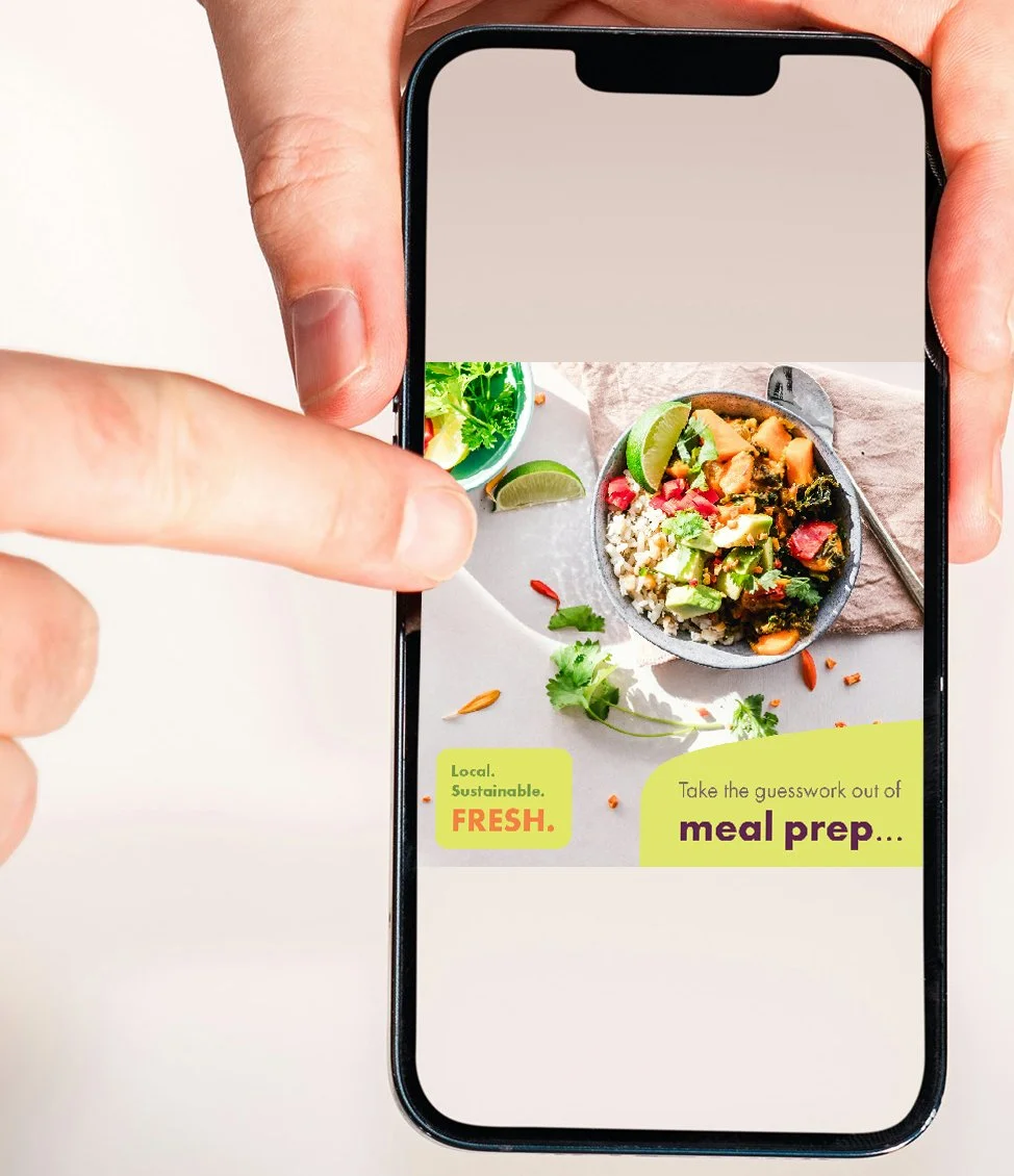
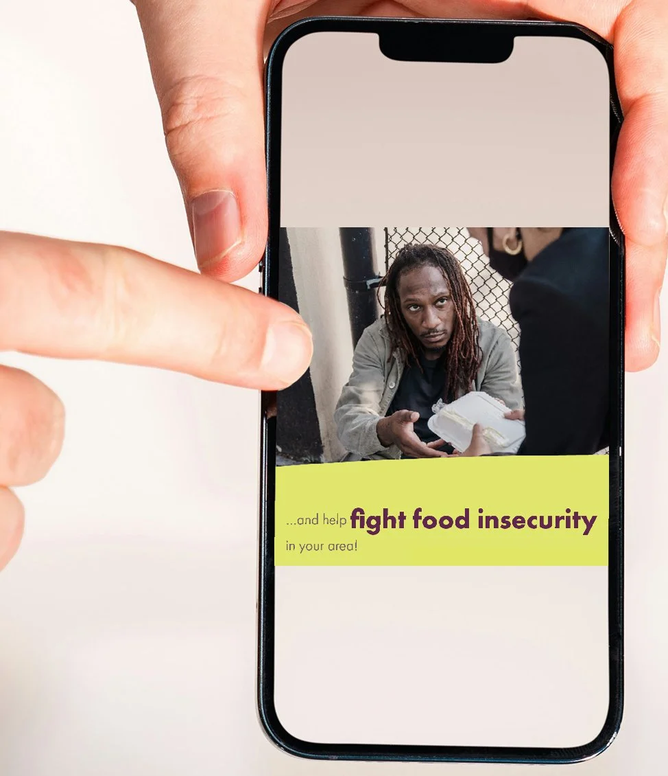

Layout
I put most of the text in one single shape to create a sense of unity among the three panels. This fits the design's purpose since each panel would be separate, but could be accessed by swiping left or right on a phone screen (see mockup).
Text
I emphasize the most important words on each slide by making them bigger and bolder than the rest. I use sans serif typography for all the text to create a clean, modern look.
Color
The project made us choose 6 out of 8 different colors. I used these colors in strategic ways. For example, I made the more important words dark purple to emphasize them over the lighter body paragraph text. I also emphasized the word “FRESH” by making it the only word that is orange. This heightens the sense of brand identity in the poster since the company is named Fresh Fare Farms.
Shape
The two shapes used both have rounded edges since sharp edges are generally not visually appealing.
Pictures
I used a picture of healthy food to portray the kind of service that Fresh Fare Farms provides. I include a picture of a homeless man receiving food to portray how Fresh Fare Farms fights food insecurity. I also included a happy family picture to relate to the target audience of families.
FACE YOURSELF


Layout
All images in the catalog are made large, making them easy to observe. There is also an adequate amount of white space between different elements to prevent the catalog from looking crowded.
Text
I make the headliner text bigger, bolder, and yellowish-green to make it stand out from the body paragraph texts.
Color
The two colors used, dark brown and yellowish green come from the “Repose” image. This creates a sense of unity between the colors and the catalog's images, leading to a more consistent look. In addition, the relative blandness of the colors creates a sophisticated look fitting for an art catalog.
Shape
I use a rectangle on the cover to make it stand out a little more from the other pages without sacrificing the minimalistic style. I also use lines to make the associations between images and the text describing them more clear.
EMOTIONS

Happiness

Layout
The text is centered on the circle, giving the design a balanced, visually appealing look.
Text
The text is rounded and bouncy, which reflects a light-hearted, and playful tone fitting of happiness. The text also vaguely resembles clouds, complementing the yellow circle that resembles the sun, building a theme of the sky.
Color
Both pink and yellow are associated with happiness and similar themes, so it made sense to use them.
Shape
I used a circle since it resembles the sun, which is commonly associated with happiness.
Peace


Layout
The text is centered, giving the design a balanced, visually appealing look.
Text
The text is in a “hippie-style” typography since the hippies were known for being advocates of peace. The slight wave filter on the text reflects how peaceful people remain calm in various situations (they "go with the flow" if you will). The text is also relatively small, reflecting how peace is a subtle feeling rather than expressive.
Color
Cool colors give off a more calming feeling hence why I used blue and green.
Anger


Layout
The text is centered, giving the design a balanced, visually appealing look.
Text
Sharp edges are associated with masculinity, which is related to anger hence I used a pointy typography. I also made the top of the text slightly bigger than the bottom to visually reflect the explosiveness of the emotion in question.
Color
I used red since it is strongly associated with anger. Since anger is a “dark” and “scary” emotion, I also used dark gray and black in the background. These colors also make the text pop out more, emphasizing the expressiveness of anger.
Shape
I include a triangle behind the text to provide further sharp edges to the design, further emphasizing the dangerous nature of anger. The triangle is big enough to be noticeable but small enough to not be overpowering over other aspects.
MISCELLANEOUS
Ice Cream Advertisement


Layout
Most of the text is on the left side, and the girl is on the right, resulting in a balanced and visually appealing design.
Text
I repeated the “free” text and made it big to give it the most emphasis out of any text in the ad. I did this because everyone likes free stuff, meaning they are more likely to order the ice cream.
Color
I used a limited amount of colors to make the design look simple, which usually equates to it being visually appealing.
Chester Bennington Quote


Layout
The text follows the telephone pole lines, covering most of the blank space in the picture and creating a sense of balance in the design.
Text
I used a round and cursive typography to reflect the melancholic and sentimental tone of the quote.
Color
The most important texts are in two different colors, blue and red, to reflect the dynamic between the two people in the quote. All of the red words are related to Chester, whereas the blue words are related to the person Chester is talking to.
Pictures
I chose a picture of a barren road for the background to reflect a line from the quote and the name of the song it comes from, “Roads Untraveled.” Further, the picture being of a cloudy wasteland also fits the melancholic tone of the quote.
RacerX Logo
Layout
The letters are close together, creating a subtle sense of tension in the logo that relates to the theme of speed inherent to the brand.
Text
The italicized text, the horizontal line going through the first “R”, and most of the letters having sharp points at their top left corners all come together to create a sense of movement that reflects the name of the company. Also, the boldness and sharp corners of the letters reflect the "edginess" of the "Racer" theme.
Color
The use of slightly dulled red and blue results in the logo looking fun while also looking somewhat “edgy”, fitting for a videogame company with "Racer" in the title.
Car Wash Poster


Layout
I have even spacing between most elements to create a consistent, organized, and visually appealing design.
Text
The words “Car Wash” are large and in a unique typography as it is the subject matter of the design. Also, this text reflects the theme of water inherent to a car wash through being rounded similar to how water flows.
Color
The use of light blue as the primary color reflects the theme of water inherent to a car wash.
Pictures
I chose a picture zoomed in on someone cleaning a car to make it clear that a car wash was being advertised, especially from far away.